Implied Volatilities vs Equity Market Behaviour: Q1 2020 vs 1H 2022
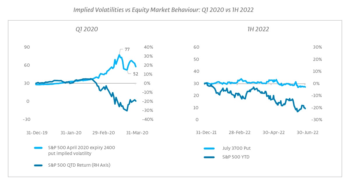
As a comparison, above we show per-strike volatility changes in Q1 2020, and a second chart zooming in on one of the options shown in the first webpage. In both charts, we also include the S&P 500 YTD return over the relevant period on the right-hand axis. Note that the scales also have larger intervals on the Q1 2020 chart – for example, the scale for implied volatility (left-hand axis) peaks at 90 whereas the scale peaks at 60 for the 2022 chart.
In Q1 2020 we saw around a 50-point change in the implied volatility of the April 2020 expiry 2400 put option, going from a starting point of around 30 to a high of 77. We pick the 2400 strike as that was the at-the-money level at the peak in implied volatility on 18th March 2020. In 2022, we pursue a similar approach to identify an option, picking the 3700 July expiry, which was approximately the at-the-money strike at the lows for the S&P 500 in mid-June 2020. That option started the year at around 30 and ended Q2 2022 at 27, trading in a narrow range throughout.
The pattern we have seen in the US has been similar across other major equity index options markets too. Again, that is unusual. In past episodes of market turmoil, we have usually seen significant changes in per-strike volatility in at least some indices if not all. Q1 2020 was indeed a large move, but periods like February 2018, October 2018, August 2015 and the Summer of 2011, also saw some notable shifts to greater and lesser degrees: it has not usually required a 2020 style sell-off to shift the volatility surface. However, in 2022, we have generally seen little movement in per-strike volatility in any of the major indices. That has resulted in fewer relative value opportunities.
What could have worked? We would like to acknowledge one area that did well early in the year: the shifts in single stocks and sub-sectors ‘under the surface’ of the equity market created an unusually favorable environment for dispersion strategies early in 2022, as many single stocks saw outsized moves, while there was relatively little action at the index level, rewarding those who were short correlation. If we had seen a more typical macro shock reaction from index volatility to the Russian invasion of Ukraine, it could have been a different story, as correlation can rise dramatically at such times, but in the end, it did not. From our observations, dispersion has mostly had a less exciting period over the subsequent months, similar to several other equity volatility strategies.
In the event, per-strike index volatility had a surprisingly muted reaction to the Russian invasion of Ukraine. While there was a risk premium built in before the event, even with hindsight it feels odd. As an example, the Euro Stoxx 50 May 3,500 put (the at-the-money strike at the market low) had an implied volatility of 33.2 on 18th February, before Russian troops entered the breakaway regions on the 21st. This was 2 points higher than its value of 31.4 at the end of January, while realized volatility was a little lower. On 24th February, the day of the full-scale invasion, the implied volatility of this option was almost unchanged at 33.7. At the trough of the market on 8th March, this volatility was only marginally higher at 34.5 despite much higher realized volatility and a 14% drop in the Euro Stoxx 50 relative to its 18th February level. By the end of March, with the war clearly lasting longer than many expected, it had dropped back to 32, below its pre-invasion level. We would be very cautious of extrapolating such limited reactivity to planning for future macro shocks.
It is also possible to have a short equity position implicitly embedded in an options position – buying VIX futures would give this to some degree. But as we’ve seen above, this would have been flat or down YTD, and a simple short equity position would have fared better. What else? Strangely, and with the considerable benefit of hindsight, selling equity tail risks would have been a favourable strategy – precisely the approach that would have had large losses in March 2020. The combination of declines in per-strike implied volatilities, coupled with relatively muted realized volatility in equity markets so far this year has been somewhat of a boon for strategies which engage in selling (downside) volatility. Of course, with jumps in other asset class volatilities, selling tails broadly would have been another story.
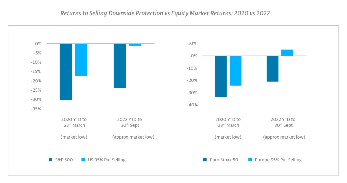
That selling tail risk was a profitable strategy is another oddity in a year of double-digit equity declines, and we would be wary of extrapolating this into the future, particularly as pricing has shifted against this, as we will see later on below. First, let us look at a simple version of being short downside. The graph below compares the year-to-date (“YTD”) performance of strategies selling 95% puts on the S&P 500 and on the Euro Stoxx 50 to the performance of the underlying equity indices. These are strategies selling outright equity tails, with potentially large losses, but receiving a premium for doing so. Whereas such a strategy tends to incur sizable losses in periods of significant market drawdowns, as in 2020, in 2022 this approach was able to notch a flat / positive return even around the trough of the drawdowns at the end of September.4
Returns to Selling Downside Protection vs Equity Market Returns: 2020 vs 2022
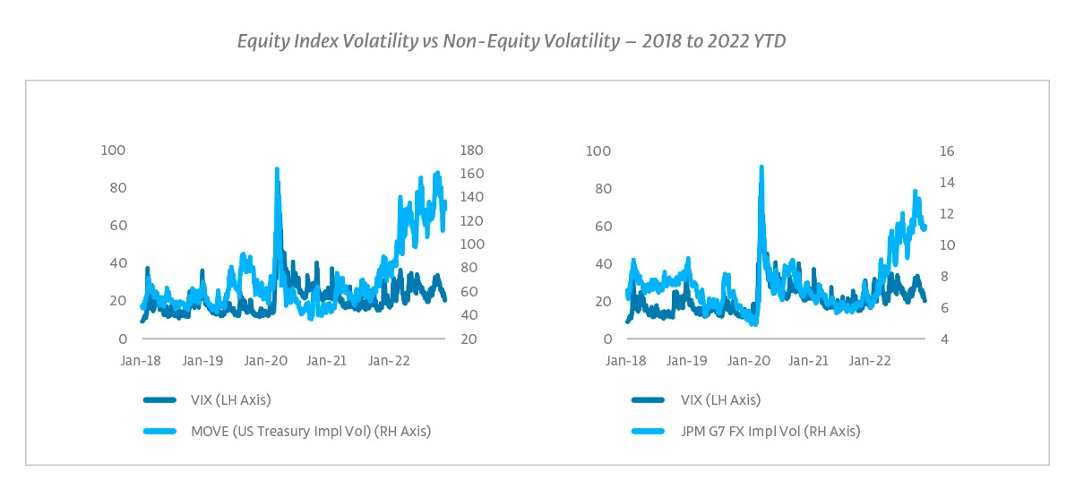
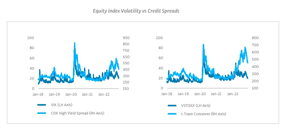
Is the lack of equity index volatility shifts simply a reflection of general volatility behavior? No. We have seen higher implied volatility in other asset classes such as fixed income and foreign exchange, creating a marked disconnect with the relationships with equity implied volatility seen in recent years (see charts below). Is it because there aren’t concerns about corporate health? That seems unlikely, because we have also seen a widening in credit spreads (see charts on the next page), particularly in Europe. Again, credit spreads tend to be closely related to equity volatility, which is intuitive given the capital structure relationship.
What is priced in now?
This leaves markets with an interesting set up, whereby equity index volatility looks to be the odd one out, potentially underpriced vs implied volatility and risk measures in other asset classes.
Equity Index Volatility vs Non-Equity Volatility – 2018 to 2022 YTD
Equity Index Volatility vs Credit Spreads
One factor influencing implied volatility is of course realized volatility and it is notable that realized volatility in equity indices has been somewhat muted relative to the kind of sell-off behavior we are used to, while we have seen more extreme realized volatility in places like fixed income. In equities, realized volatility has generally been in line with long-run behavior, rather than the typical fatter left tails (i.e. big down days) we normally see during major sell-offs.
One common measure is to compare implied volatility to realized volatility. Implied volatility typically trades above realized – creating the famous volatility risk premium. However, in several markets implied volatility is now below both recent realized volatility and long-term average realized volatility. Implied volatility itself is generally at or around long-term averages, and is below in some markets.5
Implied and Realized Volatility vs Long-Run Averages – Snapshot as of 25 November
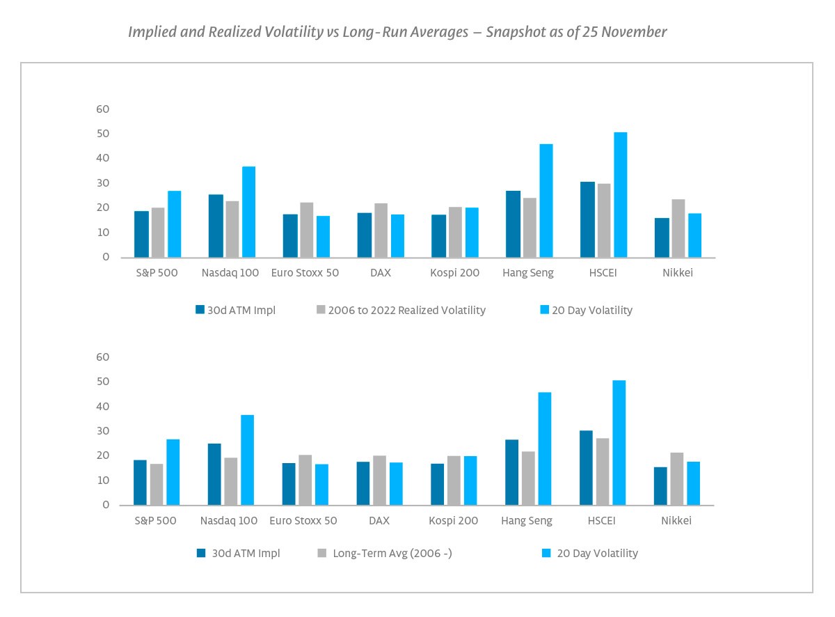
This configuration of realized volatility exceeding implied volatility tends to occur in periods of high volatility, where the market expectation embedded in implied volatilities is that high movement will retreat from its peaks. This time around, however, realized volatility levels are not particularly high (except in Hong Kong). As noted above, many indices’ implied volatility trades at or below long-run implied and realized levels. Furthermore, most volatility curves (as well as the VIX curve) are upward sloping. In other words, the low or negative risk premium is not because volatility has been oddly high. This begs the question as to whether an expected further decline of equity volatility is realistic or stems from a perceived self-fulfilling prophecy of limited reactiveness of implied volatility on downside movement, which invites additional sellers of downside volatility into such movement.
What does pricing tell us about the potential for volatility surprises?
Some have attributed this lack of reactivity in equities to positioning. In a sense, in a free market every price is a function of relative buying and selling pressures, so positioning is always some part of the explanation, but it can be hard to pin down. That said, we see some evidence that positioning was likely a factor in the limited reactivity seen thus far in 2022. One observable metric is the relative cost of protection. That can be seen in the chart below of CBOE’s Skew index, which compares the implied volatilities of out-of-the-money downside and upside options. There is a notable peak in mid-2021, and levels at the start of 2022 were still relatively high.
The cost of downside protection in equities was somewhat elevated at the start of 2022 relative to upside volatility, likely because more market participants than normal had hedged coming into the year. This has the implication that the market was pricing in a more significant reaction from implied volatility to down moves in equities. As we have seen above, we did see a very big reaction in 2020, so that was not necessarily irrational. Nevertheless, it set the bar at a higher level for seeing notable per-strike volatility changes.
CBOE Skew Index – 2011 to 2022 YTD
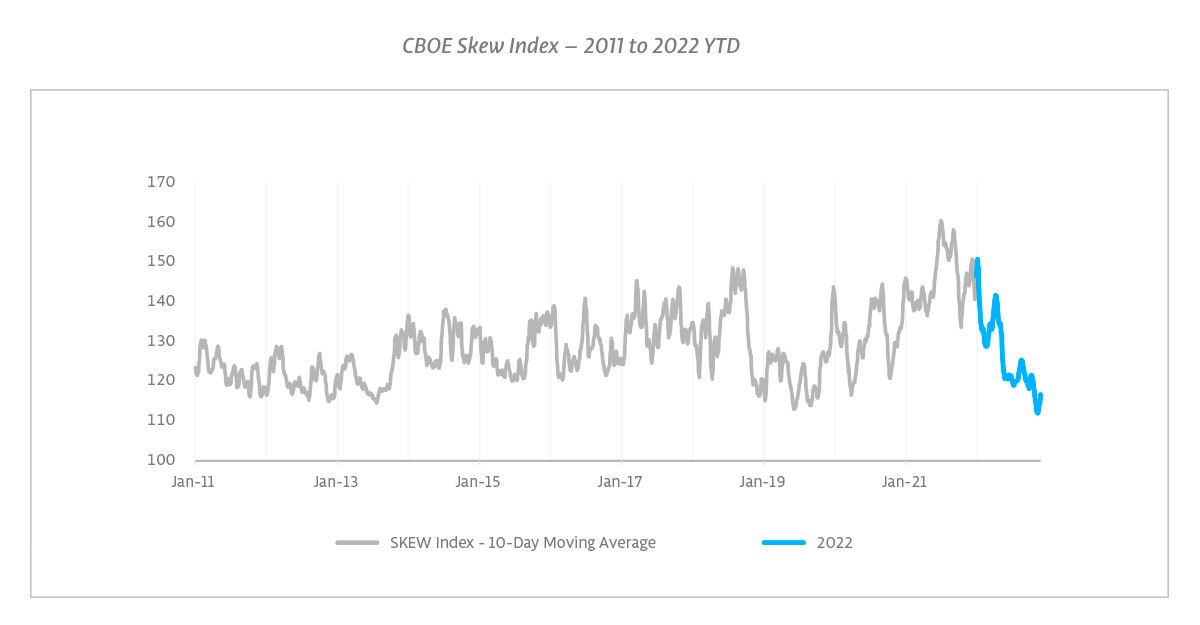
That has since markedly shifted, with skew recently at multi-year lows. The unlikely success of various short volatility strategies despite market losses, may have sparked increased interest in selling volatility into market declines, which could have been perpetuating this phenomenon – at least for now. While we stick to listed instruments, we heard from dealer conversations over the last few months that OTC exotic options that make downside ‘hedges’ conditional on short volatility positions, for example via knockout features whereby ‘hedges’ would disappear entirely in a volatility spike, had been popular with some investors. It is worth recalling that some players caught out by portfolio positions with a similar dynamic (profitable in a small volatility rise / steady market decline but losing in a volatility spike / large sell-off) were one exacerbating factor in 2020’s sell-off.
Another anecdotal example of this dynamic was the immediate aftermath of the release of the CPI number on 13 October. The number itself was perceived to be an unpleasant surprise and markets sold off instantaneously in the subsequent minutes, during pre-market trading. But in a similar instantaneous fashion, implied volatilities collapsed as well in that decline. From the shortest dated expiries all through to 3-month options, per-strike volatilities dropped by 2 points or more. Having also been on the other side of the table as market makers, we believe we have some insight as to how and why pricing shifts. The immediacy of the reaction does not necessarily point to monetization of hedges (unless various market participants opted at the same instance to unwind their hedges, not only taking profit on in-the-money shorter dated puts, but also in less obvious ones such as the new 3-month at-the-money). From observing the trading screens, it more resembled a large volatility seller making his (or her) mark into the decline.
The source of the supply of volatility is relevant. At the start of the year, coming off the highs of 2021, downside protective strikes were relatively elevated compared to at-the-money options, as noted above. In our opinion, the pricing of such skew is indicative of the degree of hedges outstanding (as dealers price on inventory, large sales by dealers of downside protective strikes to other market participants would result in higher pricing of these protective strikes going forward). From that perspective, while markets still behaved remarkably calmly, the supply of volatility at the troughs in January and February did make some sense from monetization of hedges. But in the remainder of the year, the premium for downside protective strikes has markedly come down. This could indicate both less demand for downside protective strikes, and/or higher supply (from non-dealers) of such strikes. Both of these configurations would likely feed into less supply in volatility in subsequent market declines. In a way, the environment in which volatility gets sold on declines is an elaborate (and a tad more risky) version of the traditional buy-the-dip to which we have been so accustomed over the years. Perhaps the rapid recovery after the Q1 2020 lows taught investors an overly optimistic lesson about risk. And just as the buy-on-dip strategy grew in popularity, reinforcing the mechanism with each new instance, it would not be unrealistic to assume that market participants could for some period more readily engage in selling downside volatility in expectation of volatility compression in declines, at least until relationships revert and some are stopped out. In that light it is interesting that we saw very high retail selling of volatility in November.
Below we look at this relationship in more detail, focusing in on just the downside component. The graph represents the volatility premium (in volatility points) in the market for purchasing a put with a strike of 90% of the current spot compared to purchasing an at-the-money option. This premium is plotted on the vertical axis, whereas the at-the-money volatility itself is plotted on the horizontal axis. We do this because skew is to some extent a function of the level of at-the-money volatility. We can see from the chart below that even adjusting for shifts in the level of at-the-money volatility, the premium for downside options has gone from being above average at end-2021 (the dark blue dot) to below average (the light blue dot, as of 25th November), with the depression in skew happening over Q1 to Q3, i.e. during the market decline (the grey dot shows the end of Q3).
But in our view, this configuration is even more significant given the fact that the level of at-the-money volatility has come down as well over the past months. Since the end of Q3, we have seen at-the-money volatility compress while skew has remained at similar levels.
While a trader could purchase downside protective strikes outright, a common position would be to purchase downside skew in combination with selling at-the-money (or upside) volatility. Such positioning is more volatility neutral compared to a pure long position in outright downside puts, but it does become a more pronounced long volatility position in the event of downside movement: On market declines, the long 90% put would become more near-the-money, while the short 100% call would become out-of-the-money. This flips the net position into a volatility (and gamma) long one.
S&P 500 Downside Skew vs ATM Volatility – 2006 to 2022 YTD
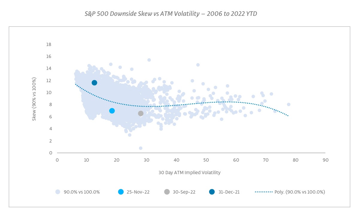
This is where the overall volatility level comes into play. The scattering of the dots along the horizontal axis indicates the degree to which volatility can spike during market turmoil. An increase in volatility indicates that the market adjusts its expectations of movement going forward, and a sharp increase in volatility thus reflects a genuine market surprise. The potential for these surprises to occur in market drops is an important driver why market participants are inclined to pay a premium for downside volatility. At lower volatility levels in general, the threshold for what would constitute a market surprise would be lower as well, thus generally from a lower starting point one would rightfully expect the reactiveness of volatility in a market surprise to be larger. As a result, this is generally reflected in a higher skew premium in lower volatility environments, as is visible in the chart above.
Currently, the depressed skew in combination with the current at-the-money volatility levels has resulted in relatively low absolute volatility levels for downside protective strikes. The absolute current implied volatility for a 1-month 90% put option is not materially different from the absolute implied volatility for a 1-month 90% put option at the end of 2021, while 20-day and 90-day realized volatilities are each around 10 points higher. The more recent compression of per-strike volatilities and of downside skew has impacted the risk/reward of selling (downside) volatility. While, if anything the magnitude of a volatility increase in the event of a market surprise has grown, the potential premium decay has come down in line with the lower levels of volatility and skew. This makes profitability from such positioning more dependent on the continuation of the pattern in which skew gets further depressed on downward movement (i.e. the expectation being volatility changes as those witnessed following the CPI surprise on 13 October).
Continue reading to the next page of this article >>
–––––––––––––––––––––––––––––––
The publication of this article is available as a PDF. Download it following the link below:
Could equity volatility come from behind to win in 2023?>>
–––––––––––––––––––––––––––––––
1. Source: Boardroom website, “Saudi Arabia vs. Argentina: The Biggest Upset in World Cup History?”, 22 November 20220
2. Source: Bloomberg, as of 25 November 2022
3. The ETFs referenced are VIXY and VIXM and are referenced for illustrative purposes only.
4. Metrics shown are based on JP Morgan 95% fortnightly put selling indices. Source: Bloomberg.
5. As with any short-run measures it is important to note that these can be sensitive to the time period chosen; for example, the S&P 500 realized volatility over the period is notably influenced by the market’s reaction to the CPI; the implied volatility also includes the period over the upcoming FOMC meeting. Both of these are examples of factors we take into account when making trading decisions. However, we believe the general point above is robust to a more nuanced analysis.
6. Sources: True Partner, Robert Shiller. Provided for illustrative purposes only. No representations are made regarding index performance. Data is based on returns and earnings data sourced from Robert Shiller’s data website. Information is the latest available as of 25 November 2022.
7. For ABX pricing, see for example: bis.org
8. Attribution comments based on industry conversations and sources such as the SG Trend Indicator: societegenerale.com
- Investment Advisory in the new Space and AI age
- ”He will win who knows when to fight and when not to fight"
- Are we heading to a new ICE Age?
- AI Top or Slop: When Markets Reach Peak Magnificence
- The Hedge Fund Journal features True Partner's award-winning volatility strategies
- True Partner Fund wins award for strong performance
- True Partner releases new thought piece focused on Dutch pension funds
- True Partner Fund nominated for best performing relative value fund
- Bloomberg article highlights True Partner’s strong performance in April and year-to-date
- Bloomberg Publication: True Partner Volatility Hedge Fund Gains 5.9% During April Rout
- More news articles >
- Go to events >